
css三角形怎么画,css画三角形的3种方法。在工作中常常遇到需要绘制三角形的需求,但css实现绘制三角形的方式有很多种,你知道有哪些方式可以绘制三角形呢?
小编一共总结了三种方式实现绘制基本的三角形。
使用边框的方式
采用渐变的方式实现
使用clip-path
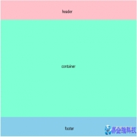
首先我们要准备一个容器
<div class="container"></div>
1. 使用边框(border)绘制三角形
使用css中的border属性可以快速实现绘制一个三角形。
首先我们要将该容器的width和height都设置为0,这样容器的四条边border设置任意值都会相交,可以利用交点来绘制三角形。
.container { width: 0; height: 0; border: 100px solid; border-color: orangered skyblue gold yellowgreen; }

通过设置容器的宽高为0,给边框(border)设置宽度,实现了4个三角形形状。因此我们可以根据border这个特性来绘制三角形,在绘制时,可以将不用的边框设置添加transparent。
实现指向下方的三角形,可以让 border 的上边可见,其他边都设置为透明(transparent):
.container {
  width: 0;
  height: 0;
  border-top: 100px solid pink;
  border-right: 100px solid transparent;
  border-left: 100px solid transparent;
}
上面的代码还可以这样写:
.container { width: 0; height: 0; border-style: solid; border-color: transparent; border-width: 100px; border-top-color: pink; }
实现指向上方的也是类似,将下方的border设置为可见:
.container {
  width: 0;
  height: 0;
  border-bottom: 100px solid pink;
  border-right: 100px solid transparent;
  border-left: 100px solid transparent;
}
我们可以通过调整不同方向边框的值,实现不同指向的三角形

.container { width: 0; height: 0; border: 100px solid transparent; border-right: 100px solid pink; }
实现等边三角形:

.container { width: 0; height: 0; border-left: 69px solid transparent; border-right: 69px solid transparent; border-bottom: 120px solid pink; }
实现其它不同形状的三角形(可自行探索),如

.container { width: 0; height: 0; border-left: 69px solid transparent; border-right: 190px solid transparent; border-bottom: 60px solid pink; }
总结:使用border实现绘制三角形,需要注意的点有:
(1)容器的宽高需设置为0
(2)需要设置容器各个方向边框的值,使用到的边框赋予颜色,没使用到的边框设置为透明(transparent)
2. 使用渐变(linear-gradient)
linear-gradient 需要结合 background-image 来实现绘制三角形,下面就来逐步使用渐变实现绘制一个三角形。
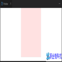
首先,我们先绘制一个矩形:
.container {
  width: 150px;
  height: 180px;
  background-repeat: no-repeat;
  outline: 2px solid red;
}
接下来给容器添加一个渐变
.container { width: 150px; height: 180px; background-repeat: no-repeat; outline: 2px solid red; background-image: linear-gradient(45deg, pink 50%, rgba(255, 255, 255, 0) 50%); }

根图形需要调整 background-size 和 background-position的值,同时也需要调整角度,使三角形的顶边是从左上角开始,直到右侧的中间。
.container { width: 150px; height: 190px; background-repeat: no-repeat; outline: 2px solid red; background-image: linear-gradient(32deg, pink 50%, rgba(255, 255, 255, 0) 50%); background-size: 100% 50%; background-position: top left; }

到这里已经基本实现一个三角形了,但还不是我们想要的效果,我们还可以添加渐变绘制一个三角形
.container { width: 150px; height: 190px; background-repeat: no-repeat; outline: 2px solid red; background-image: linear-gradient(32deg, pink 50%, rgba(255, 255, 255, 0) 50%), linear-gradient(148deg, pink 50%, rgba(255, 255, 255, 0) 50%); background-size: 100% 50%; background-position: top left; }

最后调整这两个三角形的位置即可,这里使用 background-position 属性来调整,同时去掉边线,则能够达到我们想要的效果了
.container { width: 150px; height: 190px; background-repeat: no-repeat; background-image: linear-gradient(32deg, pink 50%, rgba(255, 255, 255, 0) 50%), linear-gradient(148deg, pink 50%, rgba(255, 255, 255, 0) 50%); background-size: 100% 50%; background-position: top left, bottom left; }

总结:
使用渐变绘制三角形,需要给容器设置宽高,同时进行调试出合适的渐变角度,相对于border来说可能会麻烦一些。
3. 使用 clip-path 绘制三角形
使用clip-path,需要注意目前其在浏览器兼容性不是很好,使用时要考虑浏览器是否支持。
使用clip-path 可以绘制多边形(或圆形、椭圆形等),并将其定位在元素内。实际上,浏览器不会绘制 clip-path 之外的任何区域,因此我们看到的是 clip-path 的边界。
首先,在容器中绘制一个带背景颜色的矩形:
.container{
  width: 150px;
  height: 150px;
  background-color: pink;
}
下面来绘制一个指向下方的三角形:
.container{
  width: 150px;
  height: 150px;
  background-color: pink;
  clip-path: polygon(0 0, 50% 50%, 100% 0);
}
clip-path属性值为什么要这样设置呢?使用 clip-path 可以为沿路径放置的每个点定义坐标,最后首尾相连形成封闭图形。
上面的情况,就定义了三个点:top-left (0 0)、bottom-left (50% 50%)、right-center (100% 0),三个点首尾相连则形成了一个三角形。
总结:
使用 clip-path 只需要在容器中绘制背景颜色,给容器设置宽高,同时设置点的位置;这种方式的代码较少,但需要考虑浏览器的兼容性问题。
以上就是使用纯css绘制三角形的三种方式,你还知道哪些使用纯 CSS 实现绘制三角形的方法?
本文地址:百科问答频道 https://www.neebe.cn/wenda/886417.html,易企推百科一个免费的知识分享平台,本站部分文章来网络分享,本着互联网分享的精神,如有涉及到您的权益,请联系我们删除,谢谢!

 相关阅读
相关阅读